 1: I believe that my craftsmanship of this piece is good if not great because it is very well blended, with fairly clean edges, and the space is defined.
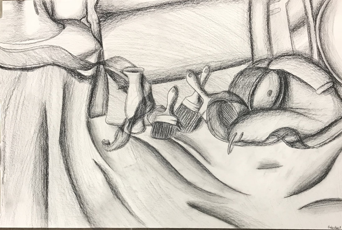
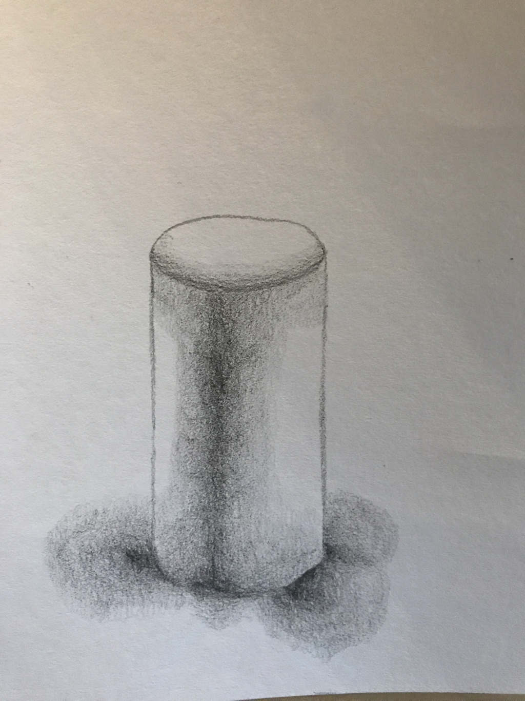
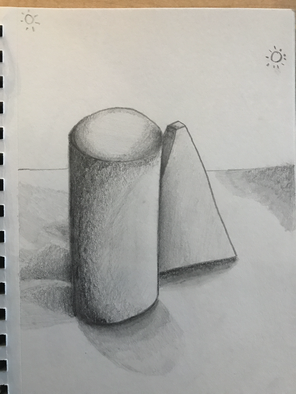
2: My values and shadows are realistic because they have many varying values as well as defined darks and lights. Values are realistic to show the different tones in the shadows and how the shadows fade into the light. 3: Yes there is a clear source of light 4: They were important to show me want not to do when I do the final. 5: The final ended up having a lot more varying values in the shadows and lights as well as defined lights. 6: For the most part they are correct but somethings are a bit bigger than they are in real life. 7: Yes I believe that the composition is pleasing. 8: yes there is a central focus that is well located. 9: I managed my time by listening to music to drown out the sounds of people talking. I could improve by not always listening to the same bands over and over again. (Fall Out Boy, Panic! At The Disco, and the Hamilton soundtrack) 10: I didn't want to do the ribbon but I got over it by just doing it. 11: I have learned that shading is important and how to successfully shade.
0 Comments
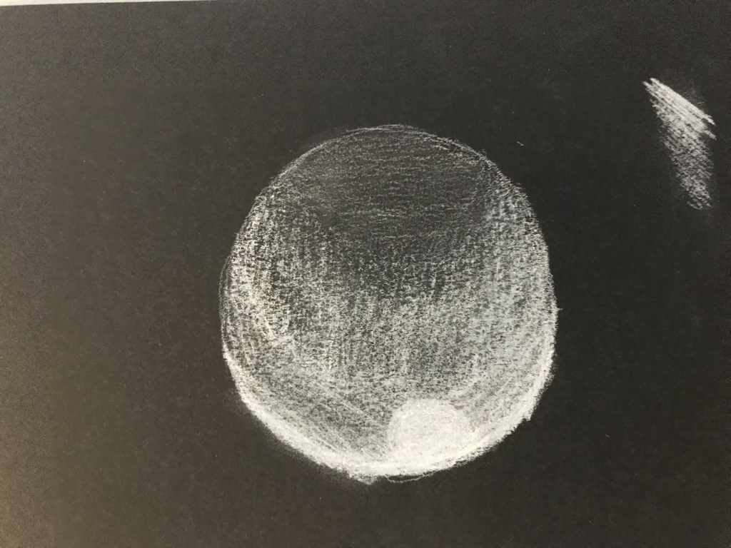    I loved doing the shading on the white because of how easy it is to blend the colors and make a nice gradient.
 These took me a long time but I am very proud of how they turned out! I love the way that the shading looks.
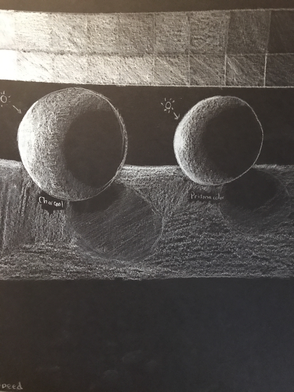
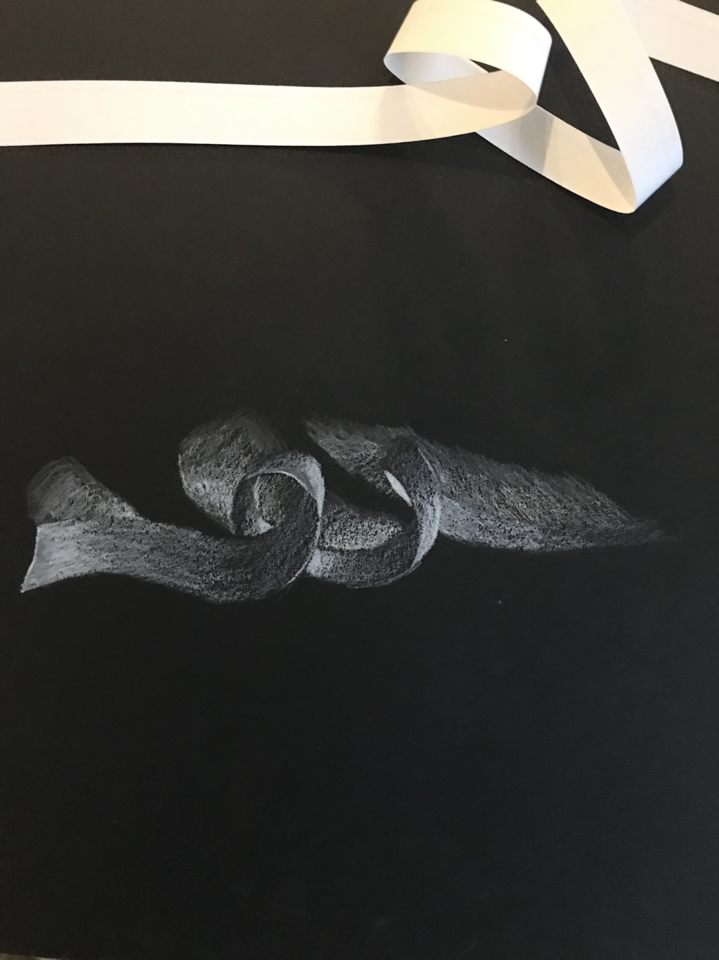 I love the shades of white in this one but I dont like how the shadows came out
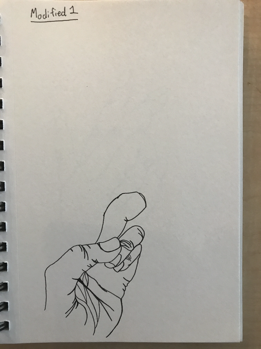 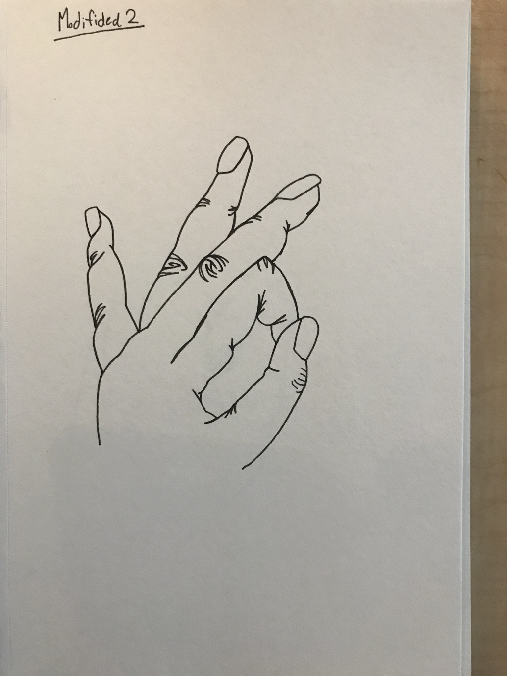 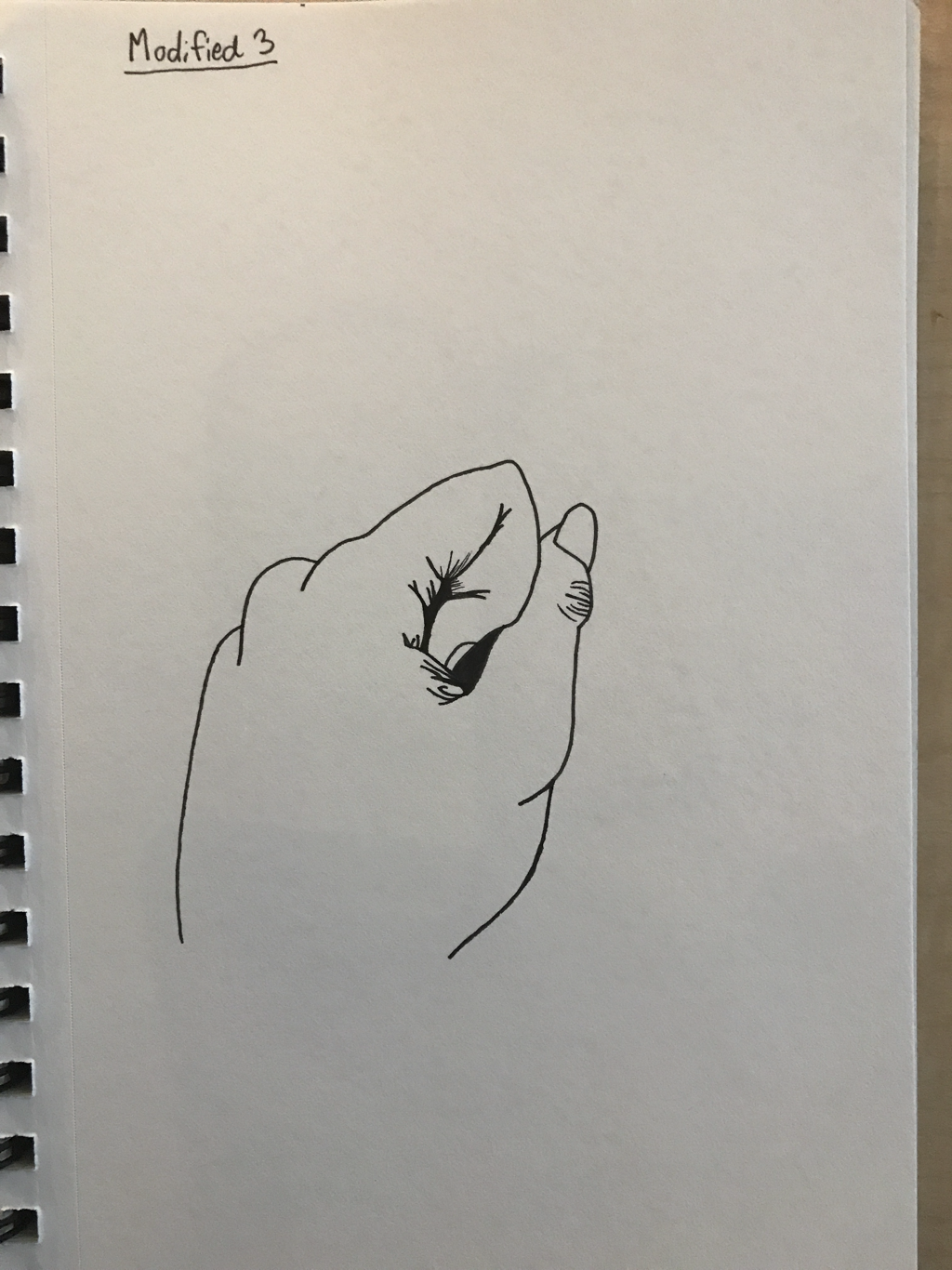 i like these because most of them turned out really well, (except for number one) and they look pretty good! I like the second one the best because of how the fingers turned out.
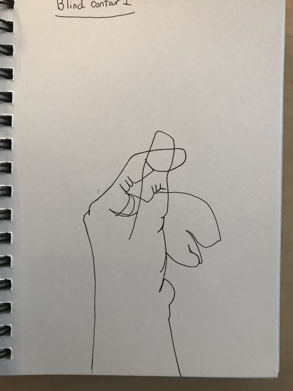 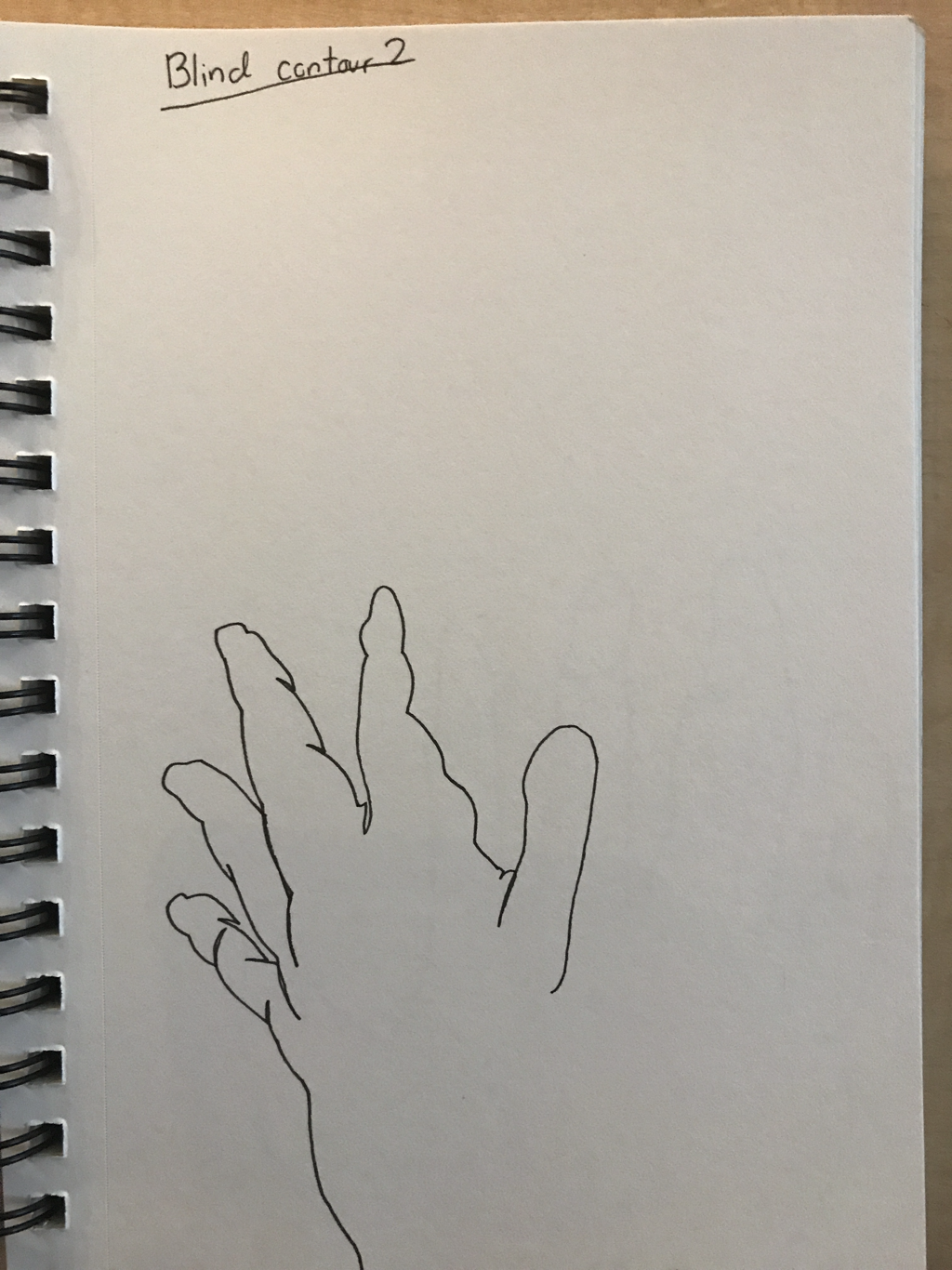 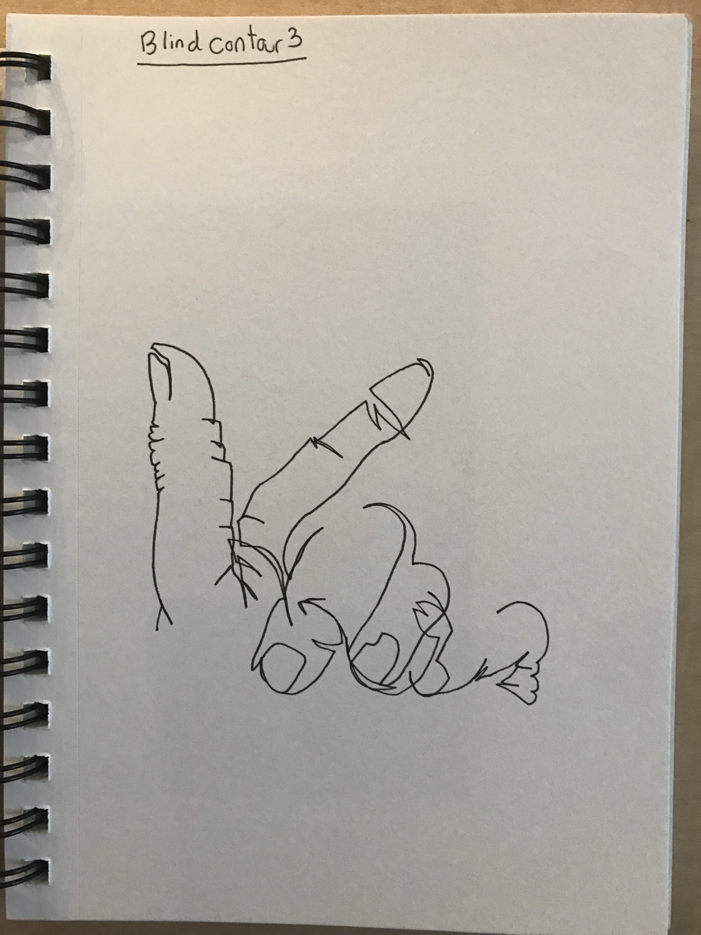 I had a lot of fun drawing these, we couldn't look and it makes it really interesting to see how it comes out! I love the last one because it looks really cool.
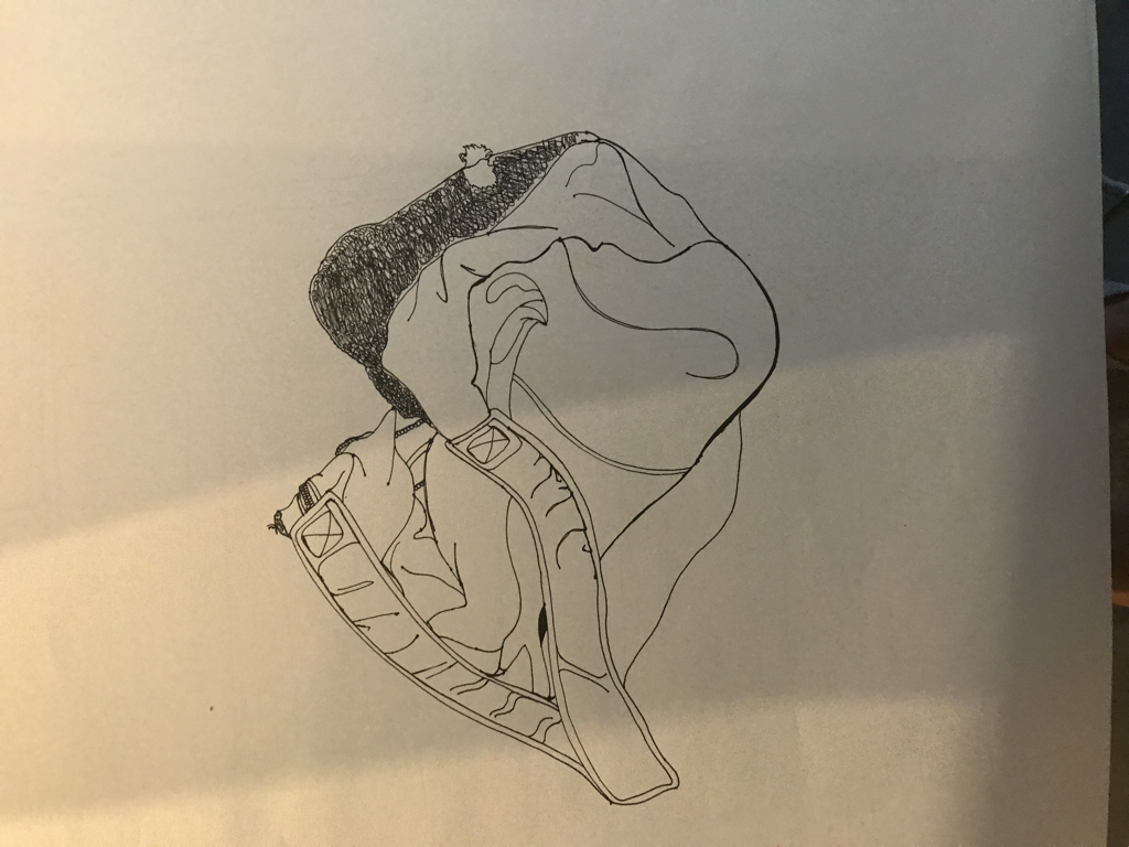 We put my backpack on the table and I drew it by sight, trying not to lift my pen. I didn't do as well as I thought but I tried and that is what counts!
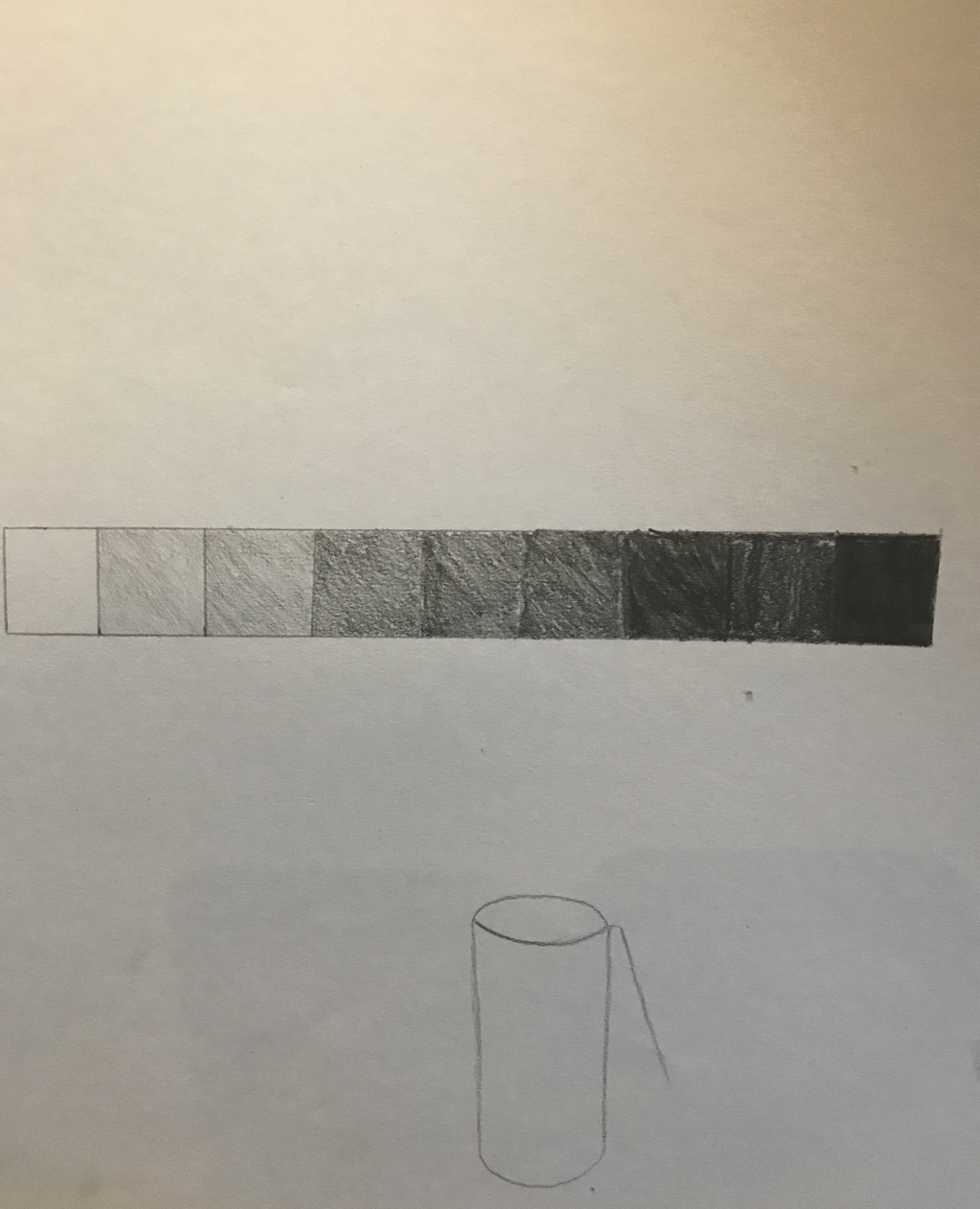
I used a wide range of values and this is evident because the fade between black and white is very smooth. My practice contributed to this piece because the more I shaded the easier it was for me to blend the colors so it was smooth. I ended up using both black and white charcoal on a black paper so that if something got too white I could go over it and blend the black out. I applied a lot of pressure in the lightest areas and gradually lightened it in the darker areas, until I got to the black. I didn't really have an interpretation I just drew what I saw. If I interpretated it as anything it was waves and they had darker and lighter sections I'm not sure, I really love how mine came out and I don't know how to make it better 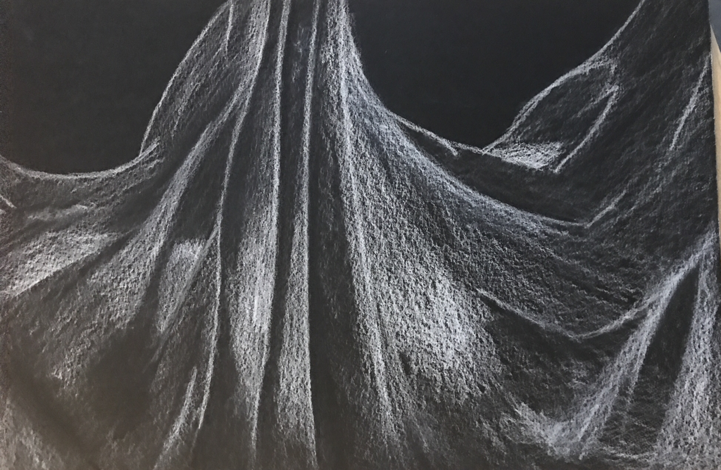 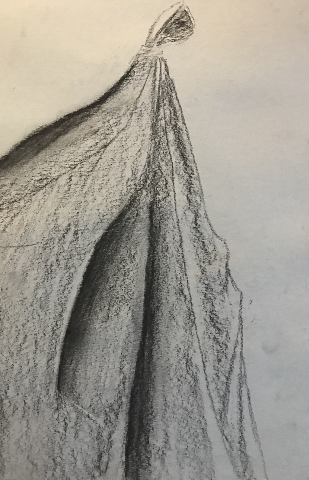 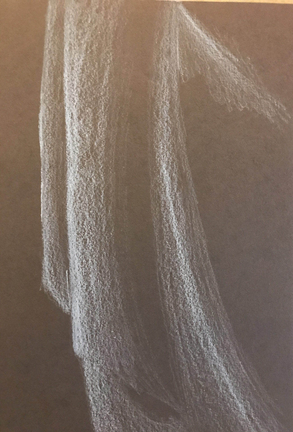 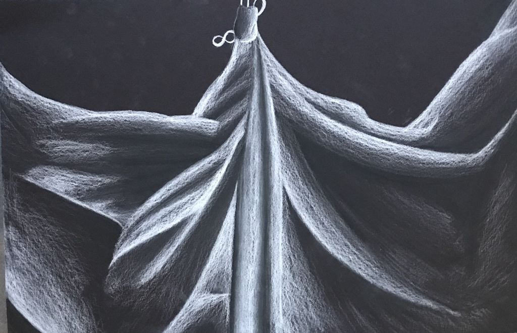 I tried to use a fluid line as best as possible, but I paused a lot and it is obvious because of the dots left on the line. The practice contributed to the success of my peice by showing my what not to do and what to do, making it easier to improve my style. The difference in contour line drawings and outline drawings is that the contour is a lot messier and is harder to interprate. My interpratation of the line is essential because if I do not have the right interpretation of the line I could mess up and draw something badly. I learned from completing this piece that I really love to pick up my pen, so this style isn't for me and if I could change anything I would use a straight edge to make my straight lines better. 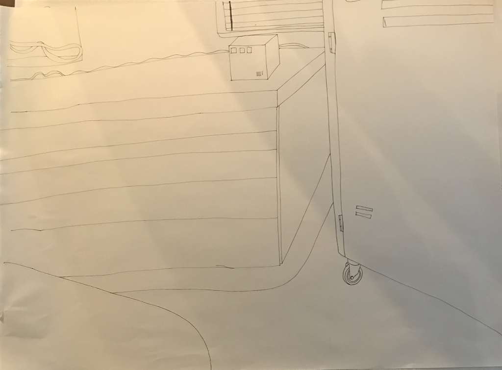 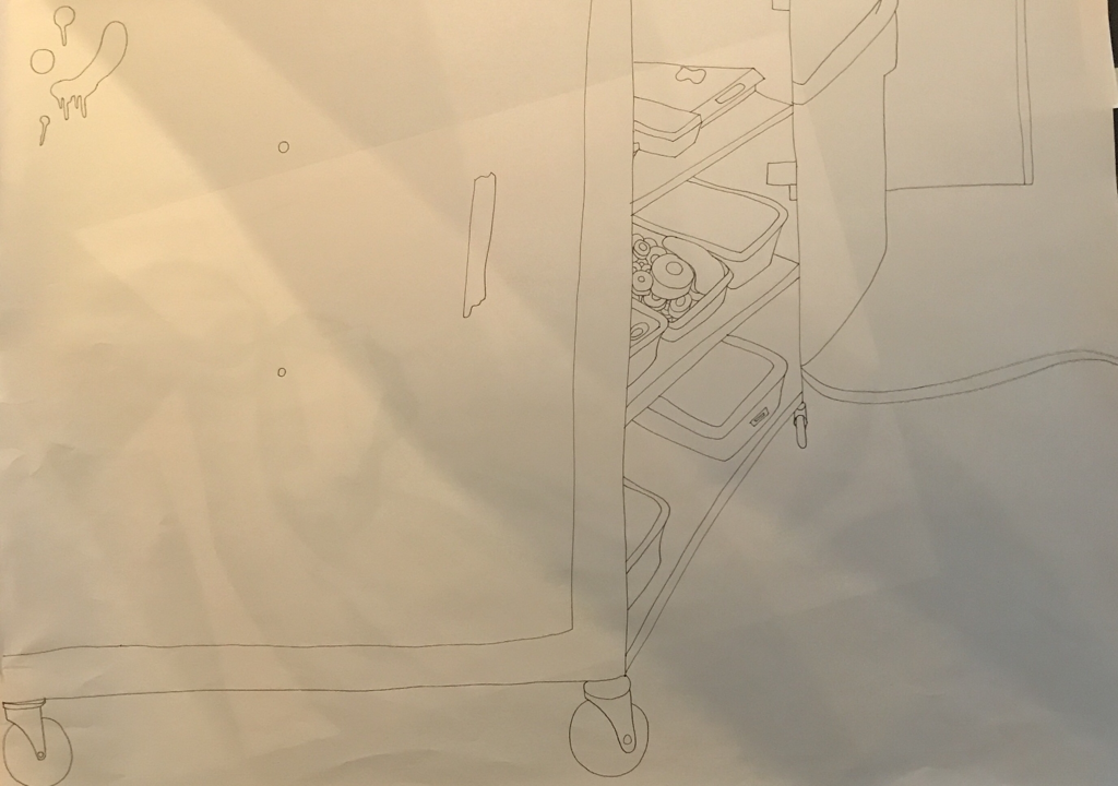 |
AuthorWrite something about yourself. No need to be fancy, just an overview. Archives
January 2018
Categories |
 RSS Feed
